Display a textbox that can contain some predefined text.
The Text Area is useful to enter a large block of text: you can pre-populate it with predefined content that can be edited.
You can also use the Text Area to optionally insert a block of text that cannot be modified by the user (with the Do not allow changes option checked).

The Text Area displays a textbox that the user can edit.
To set Manual Input as Text Area
In the Manual Input design window, choose Textarea in the Display as box.
Customizing the Text Area Manual Input
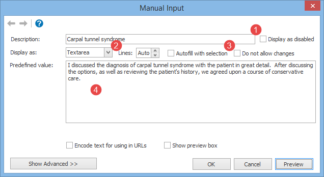
You can customize the Text Area Manual Input through the following options:
1.Display as disabled: if checked, the Manual Input will be initially displayed as collapsed. This is useful only in conjunction with an Input form macro, to create optional sections that are initially displayed as disabled.
2.Lines: tells the number of lines that will be displayed in the Text Area. If left to auto, PhraseExpander will automatically adjust the height of the textbox based on the length of the typed text.
3.Do not allow changes: the content is displayed as read-only, and the user cannot make any changes.
4.Predefined value: the text that will be displayed to the user.
Macro Syntax
{#input I discussed the diagnosis of carpal tunnel syndrome with the patient in great detail. After discussing the options, as well as reviewing the patient's history, we agreed upon a course of conservative care. -[desc=Carpal tunnel syndrome][display=textArea]#}
NOTE: for more customization options, please check the Manual Input Advanced Customization.