Display a grid selection with multiple available options for each row.

The Grid Manual Input allows to select different values for each row.
To set Manual Input as Grid
In the Manual Input design window, choose Grid in the Display as box.
Customizing the Grid Manual Input
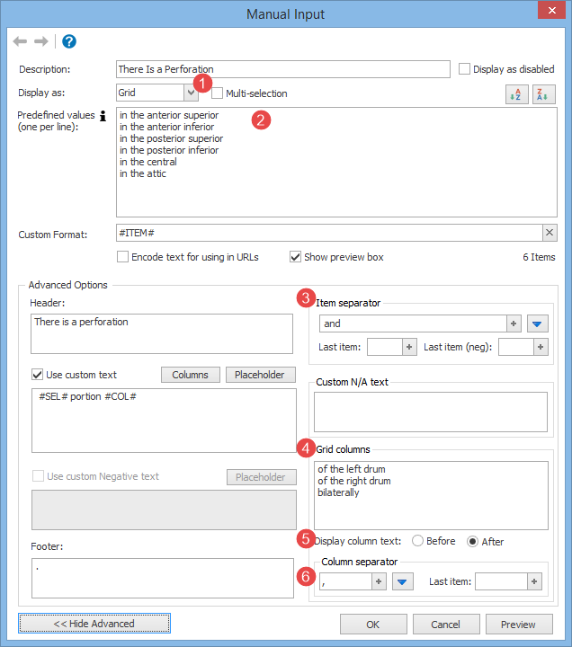
You can customize the Grid Manual Input through the following options:
1.Multi-selection: if checked, each column will be displayed with a checkbox, so that more than one item per row can be selected.
2.Predefined values: a list of predefined values the user can choose from. Each value represents a row in the grid.
3.Item separator: separates each row.
4.Grid columns: the columns to display for each item.
5.Display column text: tells if the text of the column will be displayed before or after the predefined value (e.g. before: of the left drum in the anterior superior / after: in the anterior superior of the left drum
6.Column separator: if the Multi-selection option is checked, the user can specify more values in the columns. The column separator defines how these items are separated.
Macro Syntax
{#input in the anterior superior::in the anterior inferior::in the posterior superior::in the posterior inferior::in the central::in the attic -[desc=There Is a Perforation][columnSeparator=, ][columns=of the left drum::of the right drum::bilaterally][prepend=There is a perforation][append=. ][preview=1][separator= and ][usePositive=1][positive= #SEL# portion #COL#][display=grid]#}
NOTE: for more customization options, please check the Manual Input Advanced Customization.